Jon sez
You may notice a slight difference in the website. I changed the page background color slightly (from gray to dimgray) and I put together those new button icons. I downloaded GIMP and spent a couple of hours figuring out how to use it, then did some math (must get those arrows symmetrical and pretty) and voilà, new buttons. Then I slapped together a program to process the old archive pages to insert the new information and...
This is what passes for excitement in my life.
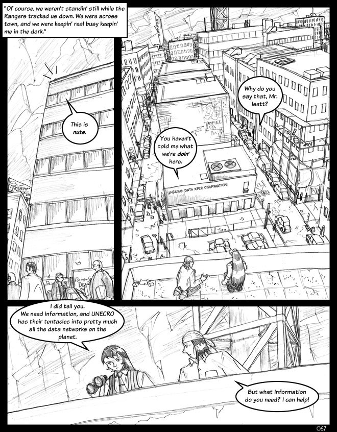
However, the slight changes to the website are blown away by the gorgeous backgrounds Mark has drawn for this page. Way to steal my thunder, dude.
Mark sez
Yeah, it turns out that AWESOME BACKGROUNDS kind of take a while to do. Still, that was one of my whole motivations behind working on this comic, so there we go.


